Visualizing your data is THE most important part during your project management (we often talk about “Data Visualization” or Dataviz”). Whether upstream to understand a little bit about how the data are arranged or downstream so that a decision-maker can make an informed decision, there is always a time when we will have to think about how to display and present our data. If like me, you like working with R, you start with a very solid and complete support to do data visualization. The purpose of this post is not to provide a tutorial; there are already a lot of resources available and it would take far too long given the range of possibilities available to us. I rather share with you existing sites to map data with R that I find very nice (with some sites to visualize spatialized data obviously!), and I will take this opportunity to introduce you to Shiny to create very powerful and easily shareable interactive dashboards.
Data visualization with R
There are a number of packages to make Dataviz on R: maptools, ggplot2, ggmap, leaflet, ggplotly, tmap, RColorBrewer, Shiny… One of the best known and most widely used is still the ggplot2 package proposed by Hadley Wickham (with a great book “ggplot2 – Elegant graphics for Data Analysis”). To work with ggplot2, you will find some reference sites that will teach you how to use all the functions implemented (https://ggplot2.tidyverse.org/reference/index.html; and the site “Statistical tools for high-throughput data analysis” which has helped me many times: http://www.sthda.com/french/wiki/ggplot2)
If you want to start by seeing a pretty impressive gallery of the types of graphics you can produce on R and especially with ggplot2, I invite you to go on Yann Holtz’s website (https://www.yan-holtz.com/index.html). You will find two subsites that will allow you to choose the most appropriate graphics for your data to facilitate its visualization! https://www.data-to-viz.com/ and https://www.r-graph-gallery.com/
To continue in the same vein and, for motivated people who want to start training, I propose the following links:
- Quite general data visualization
- Focus on spatialized data mapping with Robin Lovelace including:
- A short article that introduces spatial data mapping: https://www.researchgate.net/publication/274697165_Spatial_Data_Visualisation_with_R
- Tutorials to create all types of maps (static, animated, interactive……) ! https://geocompr.robinlovelace.net/adv-map.html
- A focus on the generation of interactive maps:
- https://bhaskarvk.github.io/user2017.geodataviz/notebooks/03-Interactive-Maps.nb.html
- An introduction to the leaflet package: https://rstudio.github.io/leaflet/
- A focus on spatial and temporal data mapping:
- With Edzer Pebesma: http://pebesma.staff.ifgi.de/r_st.pdf AND https://www.jstatsoft.org/article/view/v051i07/v51i07.pdf
- An article in the journal of the French statistics society that details how to manipulate and display spatio-temporal data: https://informatique-mia.inra.fr/resste/sites/informatique-mia.inra.fr.resste/files/analyzing-spatio-temporal.pdf
The coupling of R and Shiny
Shiny is a package to create dynamic applications on the web from R. It is really a powerful tool to present your data interactively to colleagues, partners, customers and very simply by sharing with them just the URL of your application on the web. To use Shiny in R, you only need to create two separate codes. In the first one : “ui.R” [ui.R for User Interface; .R means it is R code], you will need to code what your dashboard is made of, including the type of tab;les/graphics/maps you want displayed and their position in the dashboard. In the second code “server.R”, you will have to fill in the background of your dashboard online, i.e. what is in the tables/graphs/maps you want to see displayed, the data used, the pre-processing steps you may have put in place…. This second code is actually very close to what you would have achieved if you hadn’t used Shiny.
To learn a little more about Shiny’s power, I invite you to take a look at the galleries of existing projects (see links below). The codes are available so you can really understand how the applications work! Some quality links:
- https://shiny.rstudio.com/gallery/
- https://www.showmeshiny.com/
- https://deanattali.com/shiny/
- https://plot.ly/r/shinyapp-map-click/ (with Plotly)
- https://rstudio.github.io/shinydashboard/index.html (shinydashboard packages)
- https://www.rstudio.com/products/shiny/shiny-user-showcase/
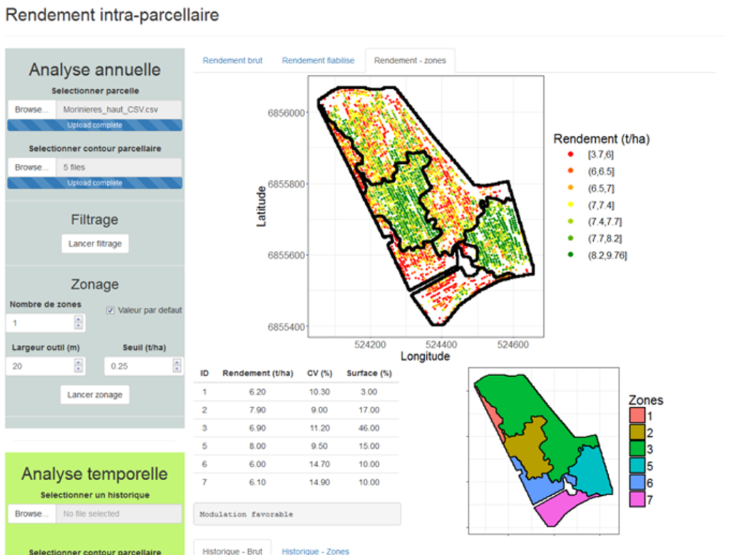
I had the opportunity to work with Shiny several times. Below, you will find an image of the application in which the objective was to delimit homogeneous production areas within an agricultural plot. The user had the possibility to configure the algorithm (number and size of zones) to arrive at the most relevant delimitation for him.
Support Aspexit’s blog posts on TIPEEE
A small donation to continue to offer quality content and to always share and popularize knowledge =) ?